Design Objective

Continental vAnalytics platform is essentially a product line providing vehicle big data insights to different businesses and consumers. The products include Connected Car Platform, Car Sharing Solutions, Used Car Marketspace and Dealership Online Financing. The goal of this landing page design is to excite purchasing specialists in dealership networks and fleet management companies by showing them how the product platform benefits them on high level.

Continental is a 145-year-old German automotive supplier corporation. By launching consumer-facing software and services, Continental really wants to flip its image from traditional tire company to innovative internet company. This microsite I’m designing will be the first touch point facing our business clients.

Research and Inspirations

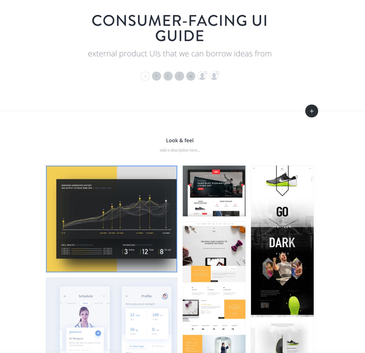
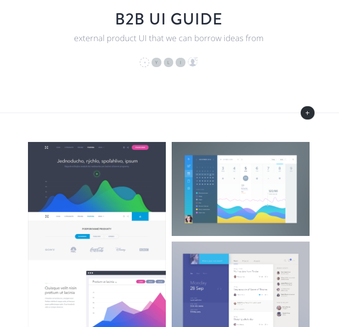
To get a clear direction on what our branding message can be, I organized a workshop with executives where we brainstormed on the key words and styles that fit the product line.The key words of the ideal microsite I collected from management team and communications team are: smart, clean and techy. Based on the key words, I put up image boards for look and feel online for team to review and leave comments.

Exploring ideas

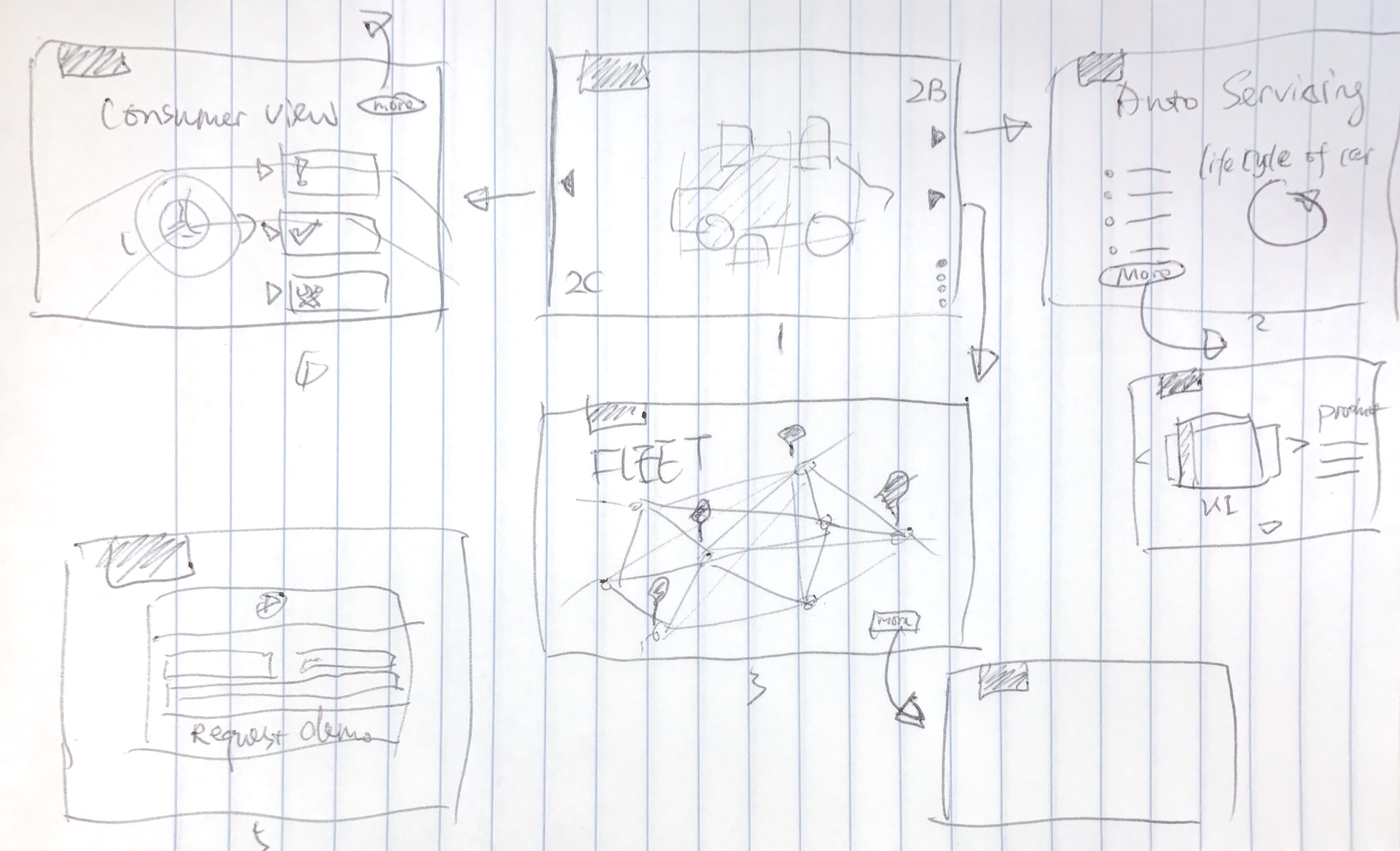
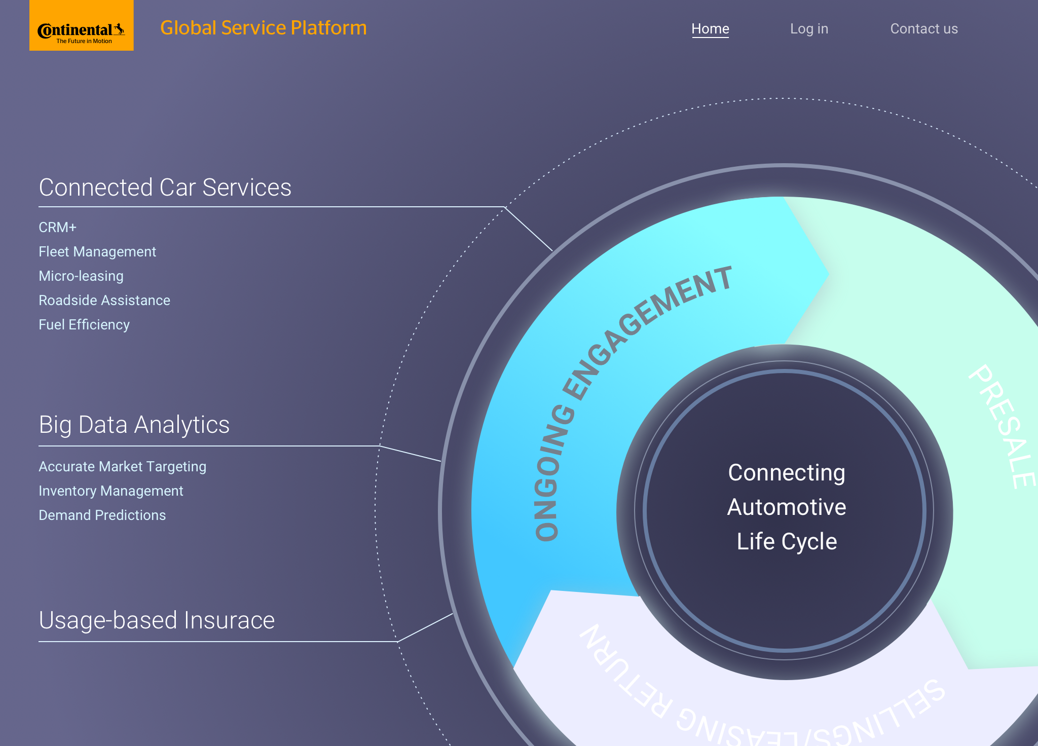
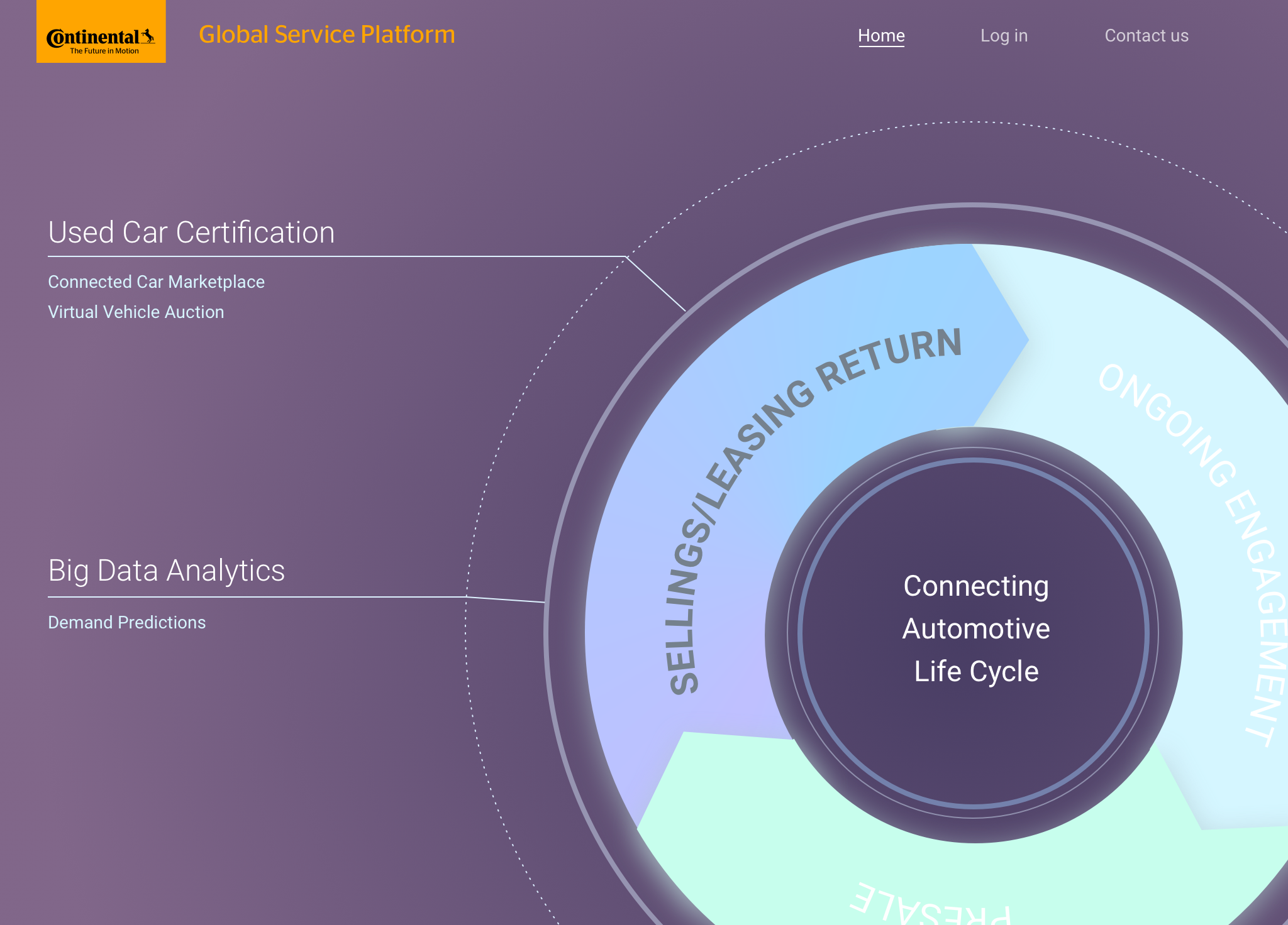
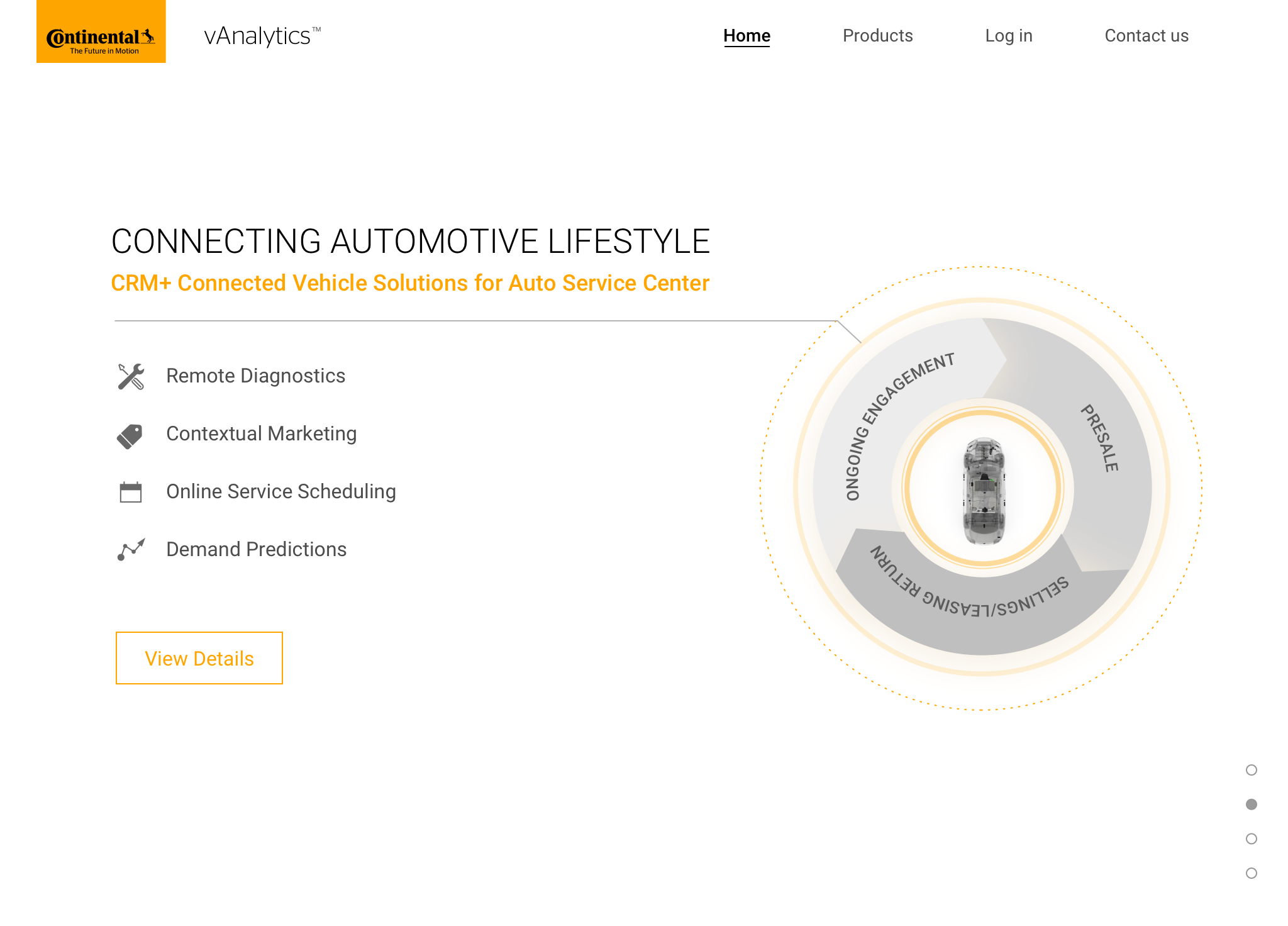
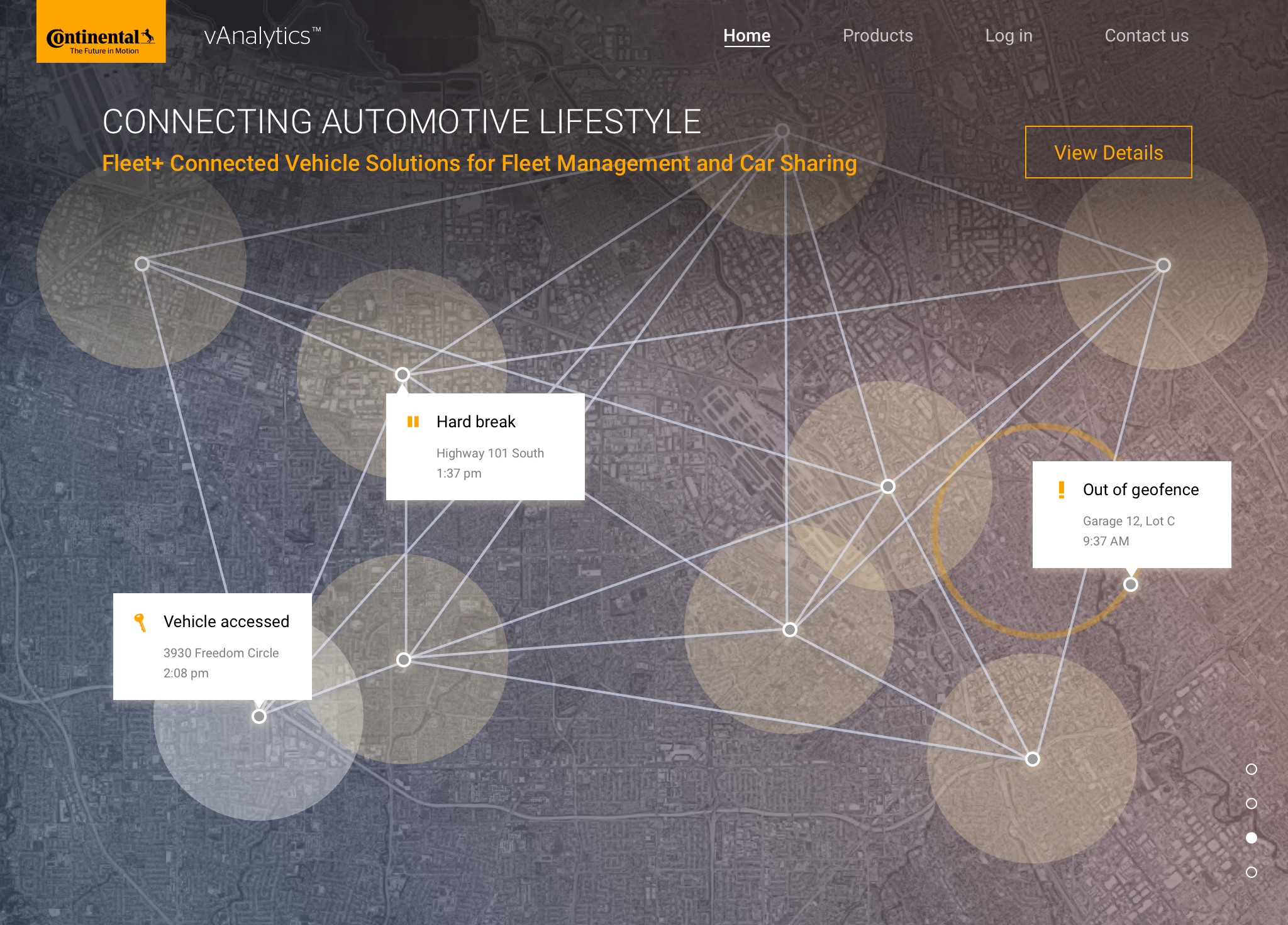
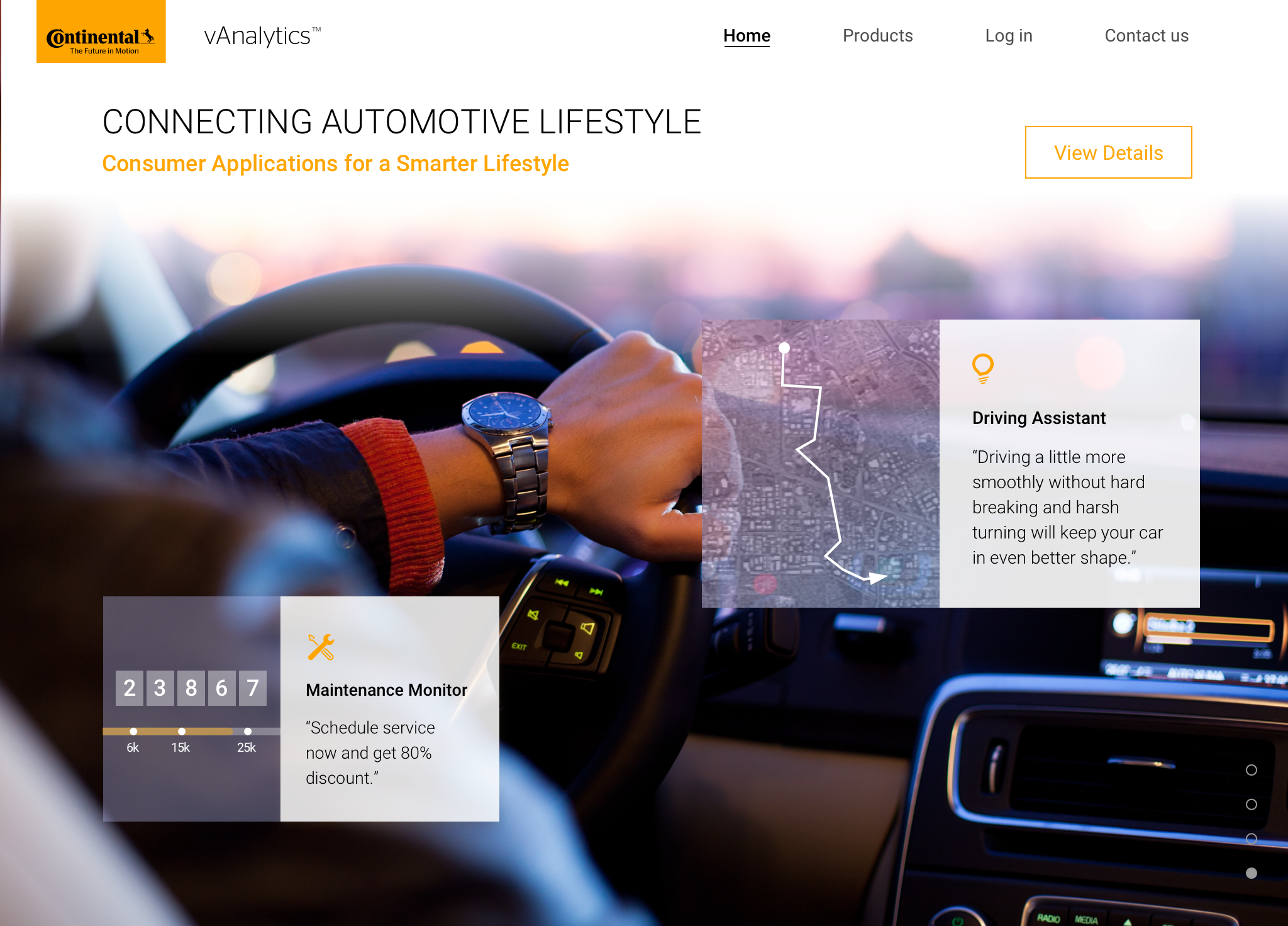
With basic sitemap decided with PM, I started off exploring different ideas. Based on our sales managers’ experience, VP of Technology at dealership networks specifically wants to understand the value of vehicle big data in vehicle lifecycle, and then will most likely talk to us after they get a clear high-level understanding. Thus, I showed sweet spots where our products can help the clients interact with their consumers, and designed it in a way that the page looks visually appealing. I tried to push the limit of how continental traditional visual identity can be recreated by adding accent colors and motion graphics.

Work in Progress

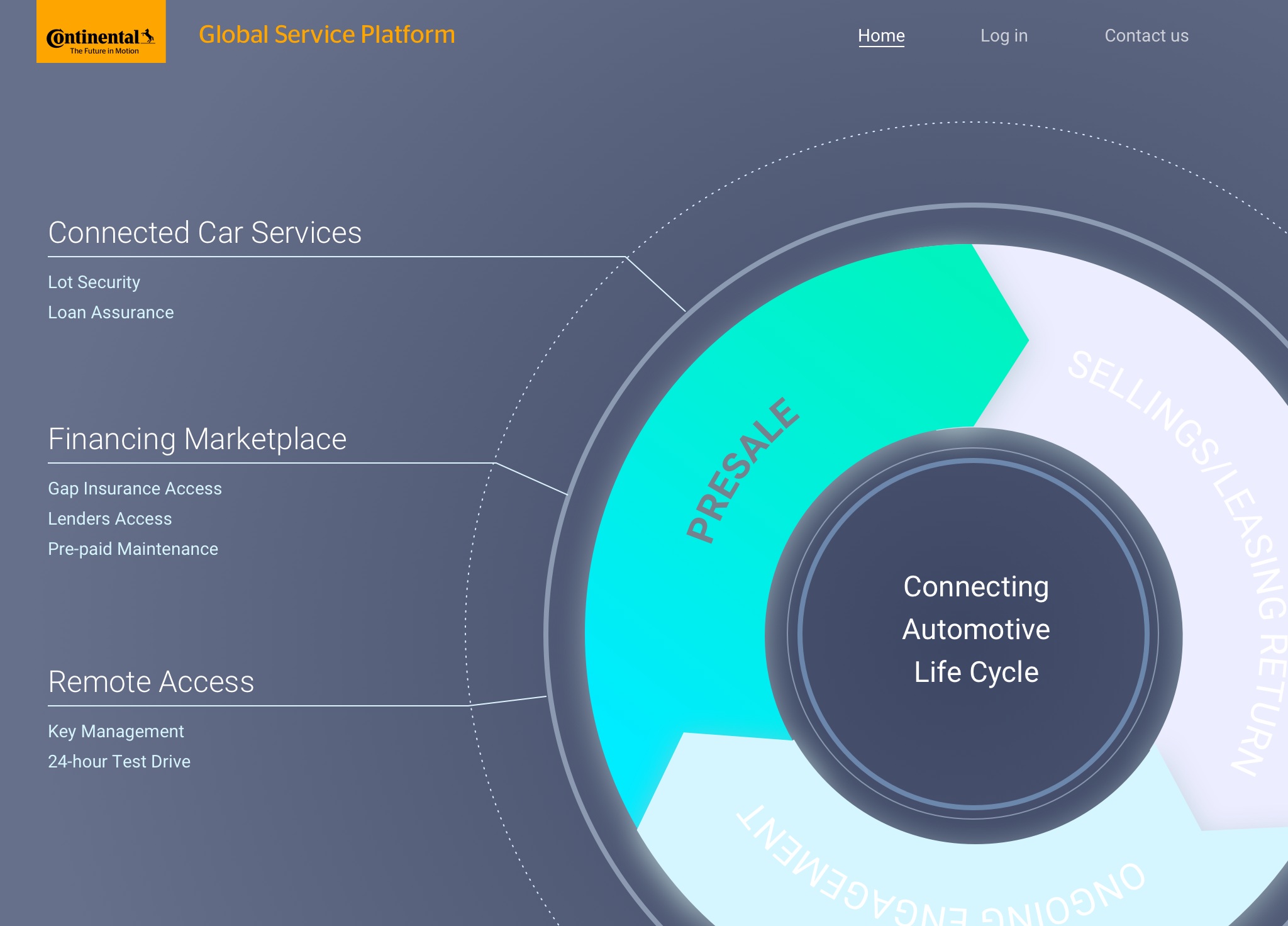
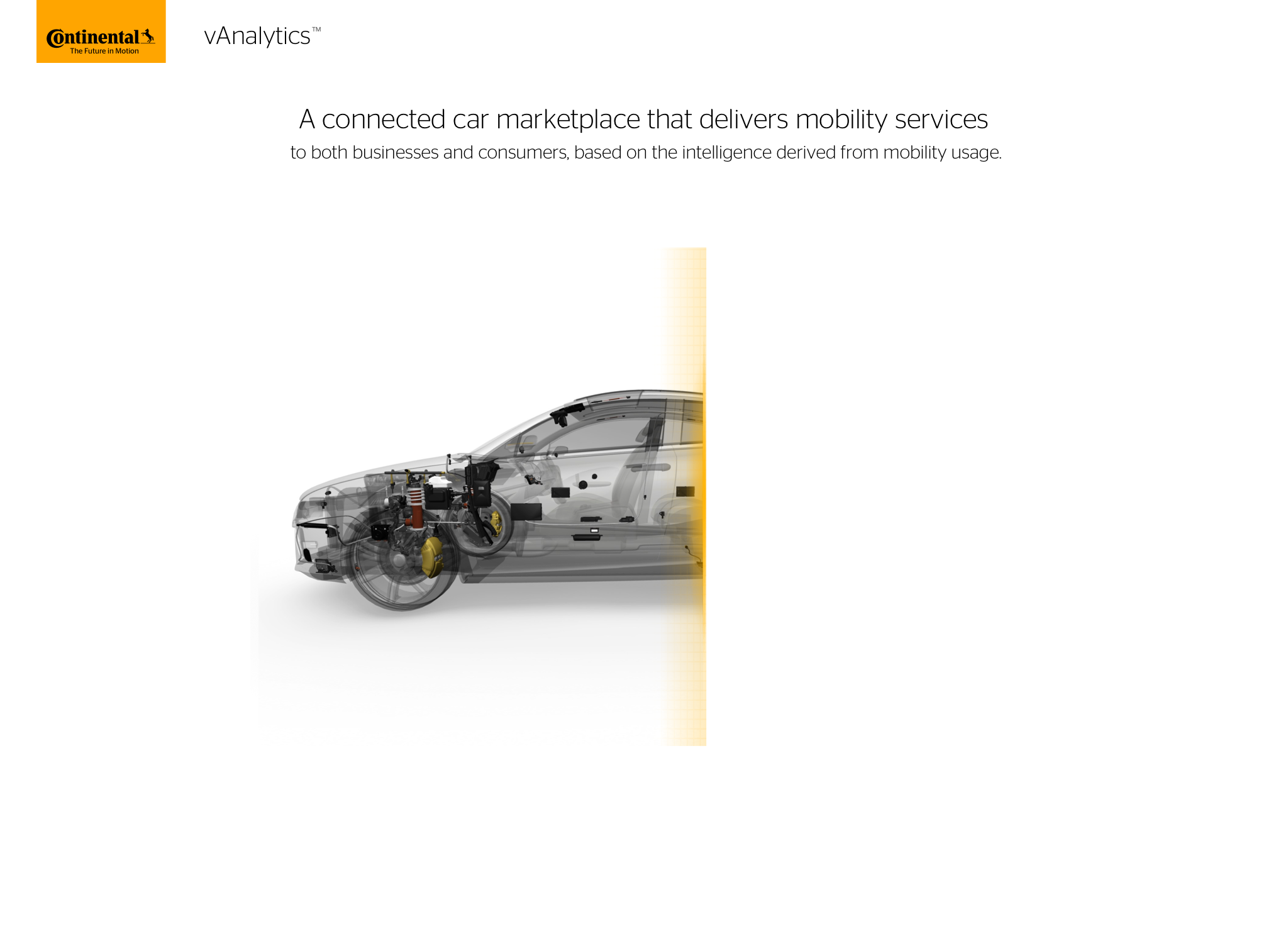
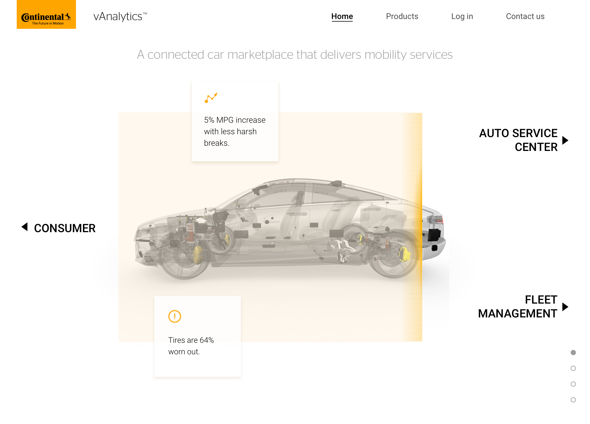
I showed the mockups above to the local executives and product team, and they were excited to see the direction I was going; though after I showed it to head of communications at Germany headquarter, I got a clear “no” on taking the brand that far with the trendy look. However, it’s a good exercise to see how far the headquarter can tolerate us iterating the visual identity. So I took a step back, communicated with Germany headquarter again, and came up with the designs below. The new iteration applies corporate branding closely by using the brand colors and fonts, but keeps the light-weighted clean techy look.